F/RS 310
Assignment #3
Climate Diagram
43 Points Possible
Objective
The objective of this assignment is to teach students to create their own climate diagrams in order to assess the climate patterns and typical conditions of particular sites. A secondary goal of the assignment is to give students more experience working with spreadsheets (ie. Microsoft Excel) to enhance their quantitative experience.
Student Learning Objectives
After this assignments you will:
- Improve your ability to work with .csv files.
- Expand the formats you can convert in Excel.
- Apply the ‘subtotals’ function to multi-step calculations in Excel.
- Use the ‘sort’ function in Excel.
- Create a figure with 2 y-axes.
- Modify axis labels on figure with two y-axes
- Add additional text to figure to enhance the information communicated with this format
Description of Activities
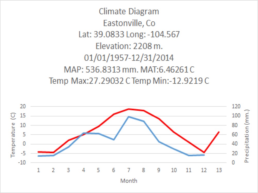
I have provided you a video that describes the process of creating a climate diagram. The video will show you where to get your data and how to process it in Microscoft Excel so that you have the data necessary to create a climate diagram (see example below). I have made video for both Mac and PC users, and both videos can be viewed on our class Canvas page.
Rubric
To get full credit on this assignment you will need to do the following:
- Download a dataset that is at least 30 years in length (5 points)
- Calculate the monthly averages for air temperature and precipitation
- Plot both temperature and precipitation on the same figure
- Temperature must be represented by a red line (5 points)
- Precipitation must be represented by a blue line (5 points)
- Add a Title to the graph that includes
- Location of your site (4 points)
- (country, latitude, longitude, and elevation)
- Mean daily maximum value of the warmest month (3 points)
- Mean daily minimum value of the coldest month (3 points)
- MAP (3 points)
- MAT (3 points)
- Years in the data set (2 points)
- Include both temperature and precipitation in the following format
- [Tyy – Pyy]
- Include both temperature and precipitation in the following format
- Location of your site (4 points)
- Two y-axes. Temperature should be plotted as your primary axis (left) and precipitation on your secondary axis (right axis). And make sure to include labels and units for both left and right axes. (10 points)
- NOTE: Remember, you DO NOT need to indicate months with freezing temperatures by thickening the x-axis.
Example of a climate diagram
